


UI/UX
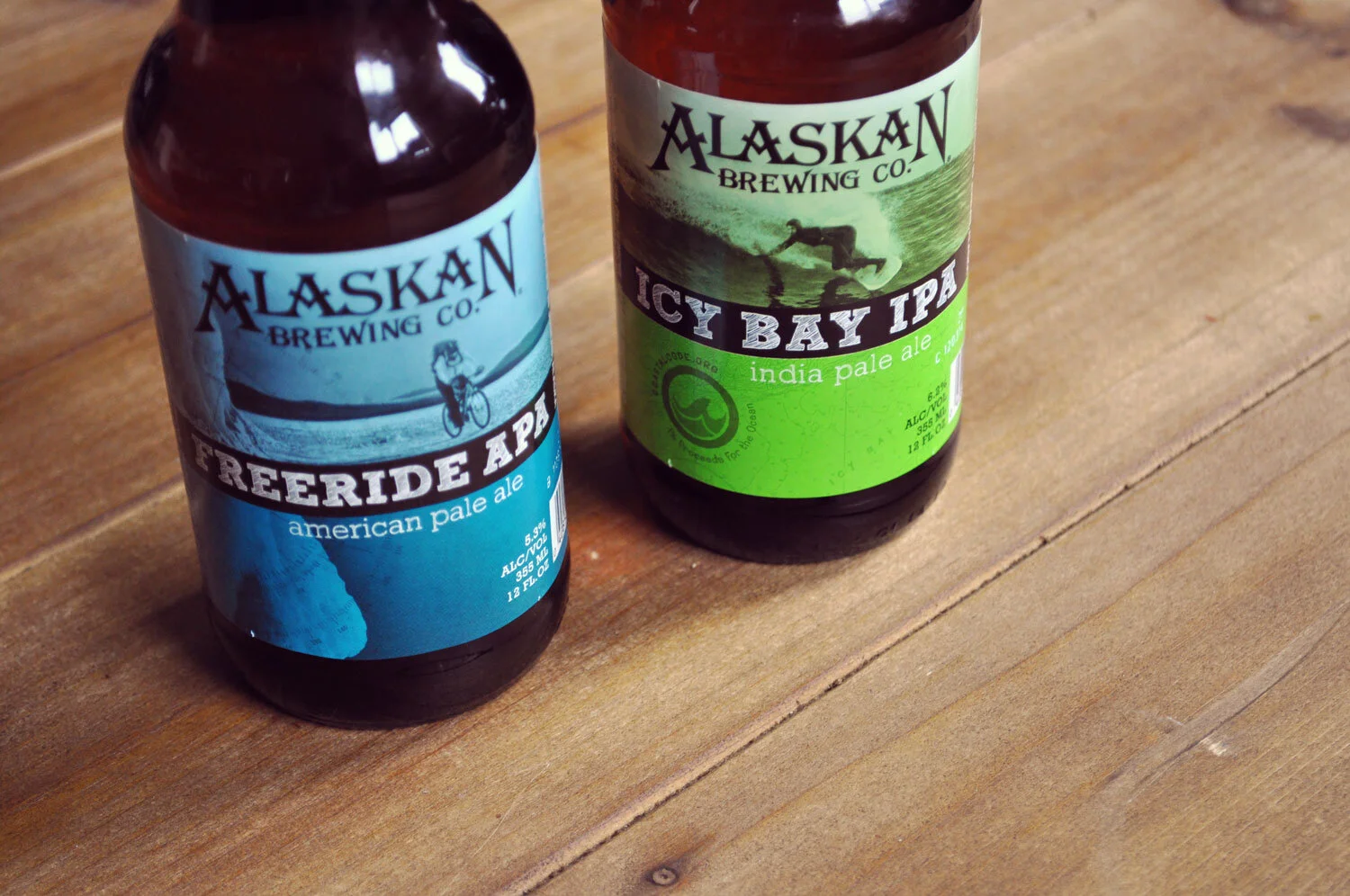
Alaskan Brewing Co. requested a new visual direction for a lineup of beers that would play well with their flagship designs.
The designs incorporated local adventure photography with topographic maps of the area and bright, bold colors to stand out on the shelf.
“First lets talk about the label. I love a good design, and the simplicity of this gray, white and green design makes me happy. A frozen hop cone to form the “O” in hop is very creative and adds to the appeal.”
— BLOGABOUTBEER.COM
The Alaskan Brewing Co. opened a retail space and requested installation design for a self-guided tour area reflecting the long history and ingenuity of the brewery.